USER EXPERIENCE DESIGN COURSE
Wisconsin Transit App Redesign
A reimagine of the transit section in the UW-Madison app that allows users to more seamlessly navigate features and track buses.
OVERVIEW
The University of Wisconsin-Madison’s mobile application includes a bus feature to help students navigate the local bus system. However, the interface for this feature is notoriously difficult to use.
We redesigned the features and interface of the Wisconsin bus app by conducting a contextual inquiry, creating various models and diagrams to interpret user data, and using our research to ideate solutions. Prototyping with Figma and user testing helped us finalize our proposal.
ROLE/SCOPE
I served as the project leader in a group of three. This was a project created during a Human-Computer Interaction class from September to October in 2021.
Our team enhanced the Wisconsin app, specifically focusing on its bus navigation feature. Despite the app offering numerous functionalities, it is underutilized by students due to significant issues with the app. Even before conducting our contextual inquiries, we heard frequent complaints from UW students about the app's slow performance and poor user interface. The navigation process is notoriously cumbersome and stressful, prompting our team of three to address these challenges.

STARTING POINT
The current app's design and functionality are quite basic, leading to a clunky user experience with many features that are either unintuitive or unnecessary. We aimed to revamp the UI and UX to improve both its functionality and intuitiveness to help students quickly and efficiently navigate the bus systems.
GOAL
Our objective was to restructure the app for easier navigation and to introduce features that facilitate faster task completion—such as favoriting frequently used destinations or navigating efficiently from point A to point B.
In addition to enhancing usability, our primary goal was to retain the unique elements of the original UW application. We wanted our redesign to cater specifically to UW students while also being competitive with other navigation apps like Google Maps and Apple Maps.
EMPATHIZING
For our contextual inquiry, we interviewed three students who had previously used the app. We observed and recorded them while they completed a series of tasks on the application. Employing the “Master & Apprentice Model,” we, as interviewers, took on the apprentice role, allowing the interviewees to assume the role of the master. This approach encouraged them to share their genuine opinions—both positive and negative—about the app without interruption.
SEQUENCE MODEL
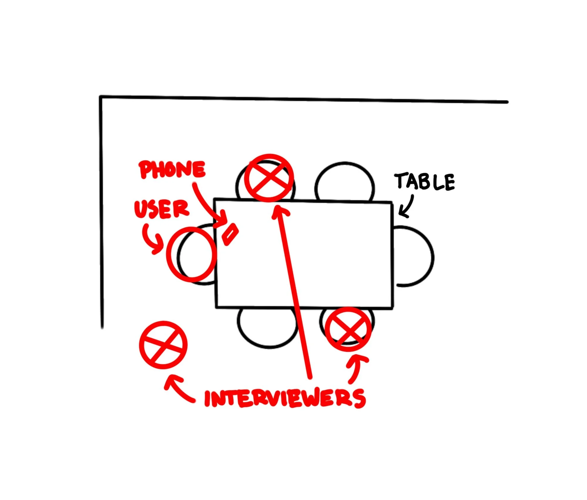
We asked the interviewees to open the Wisconsin app and navigate to the bus section, followed by a series of guided questions to direct our inquiry. The sequence of steps they took is illustrated in the sequence model bellow.
Interviews were conducted in the participants' homes, the environment where they typically used the app. The layout of our interview process is depicted in the physical model bellow.
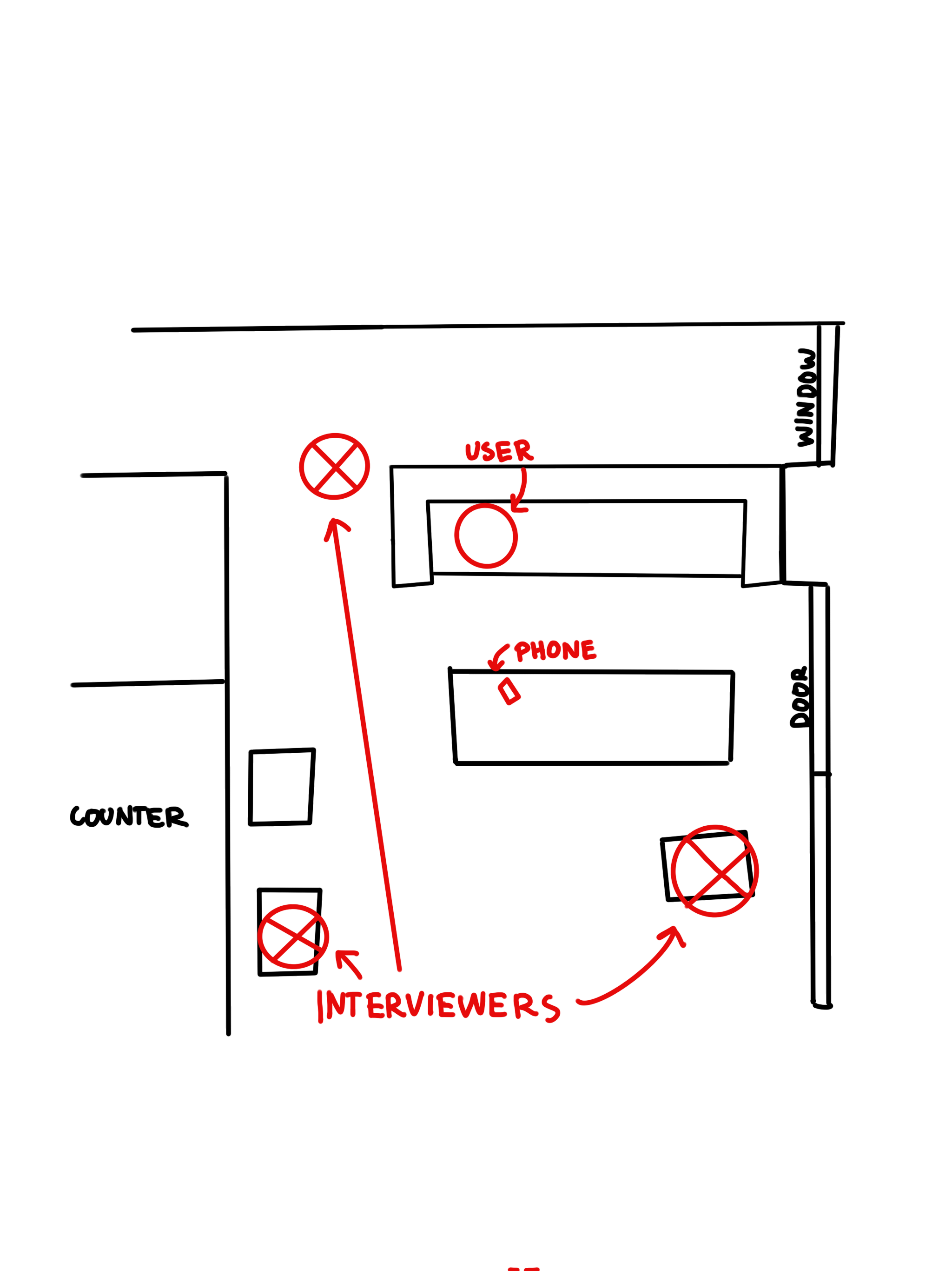
PHYSICAL MODELS
AFFINITY DIAGRAM
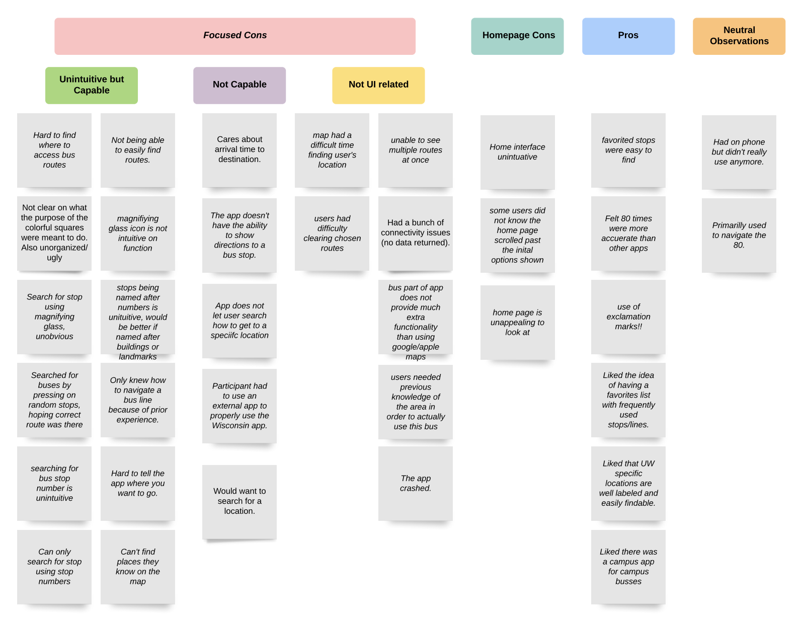
After concluding our contextual inquiry we created an affinity diagram by writing down different themes, ideas, and motivators that we noticed during our three interviews.
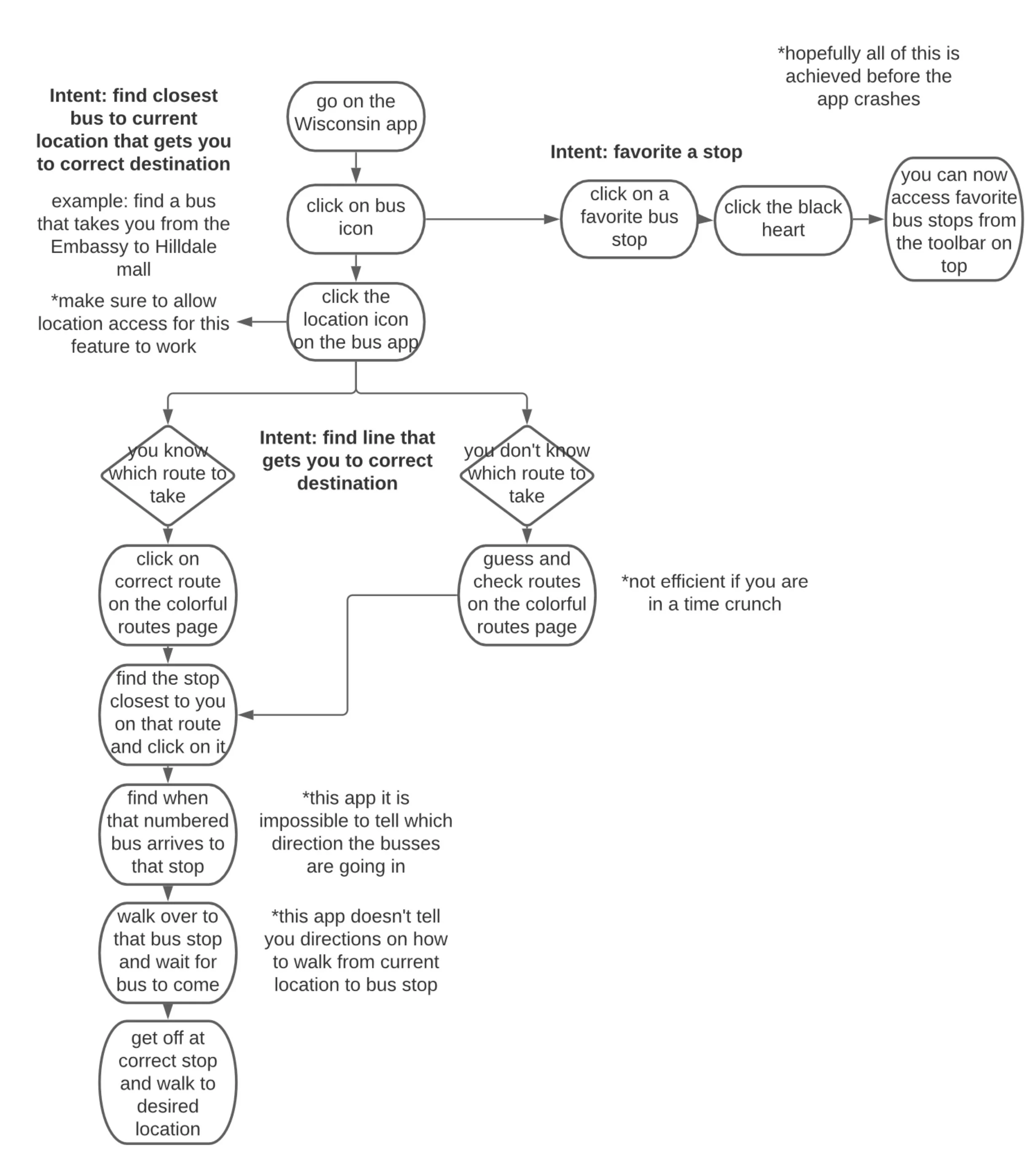
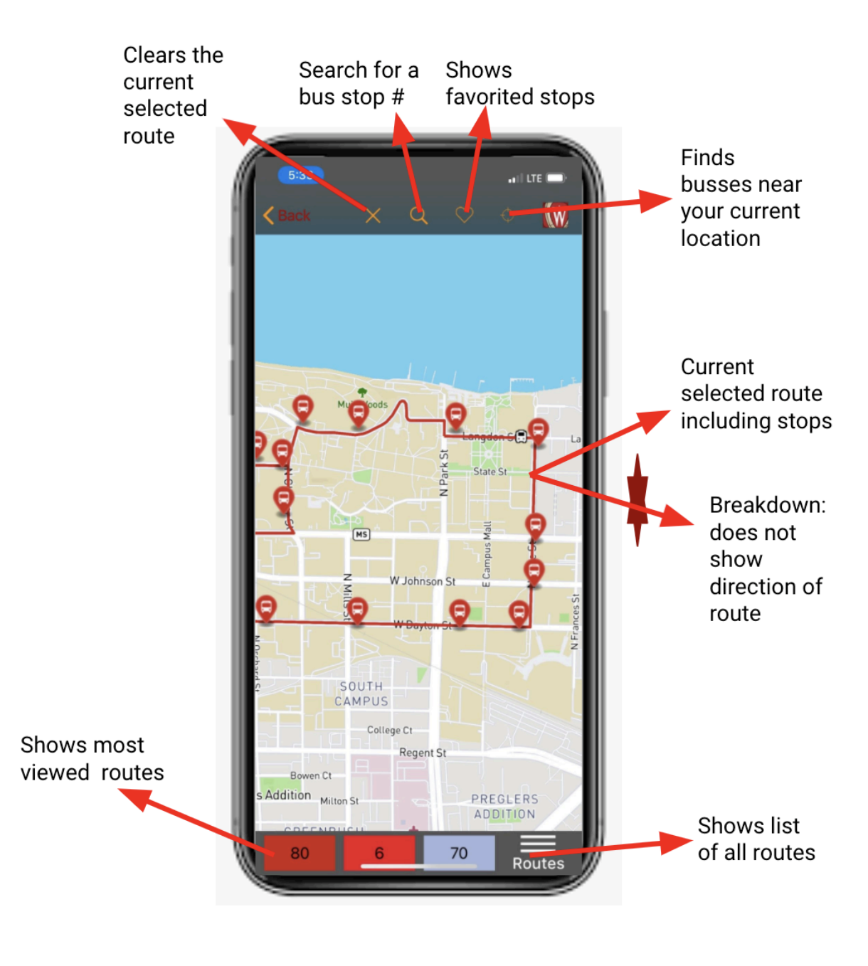
As previously discussed, the Wisconsin bus app had several breakdowns that hindered users from navigating the app and reaching their final destinations efficiently. However, we also identified opportunities for enhancement. The primary issues we identified were related to the user interface (UI), which we could address within this project (e.g., we couldn't fix app crashes). We categorized the UI breakdowns into two groups: "Unintuitive but capable" and "Not capable." Capable refers to the limits of the current features of the app. The features users appreciated were categorized as "Pros."
Our findings revealed that users found the app difficult to navigate and frustrating. When attempting to navigate to bus stops, find specific routes, and plan trips, they struggled to identify the correct sequence of actions to obtain the desired information. Many users fumbled through the app, pressing random buttons and growing increasingly stressed and frustrated. Distractions, such as needing to open other apps to answer questions, exacerbated their frustration, particularly when they were pressed for time. However, one feature consistently located and successfully used by all participants was the favoriting of stops. A detailed breakdown of the app's current features and the issues we observed during our contextual inquiry is provided in these artifact models.
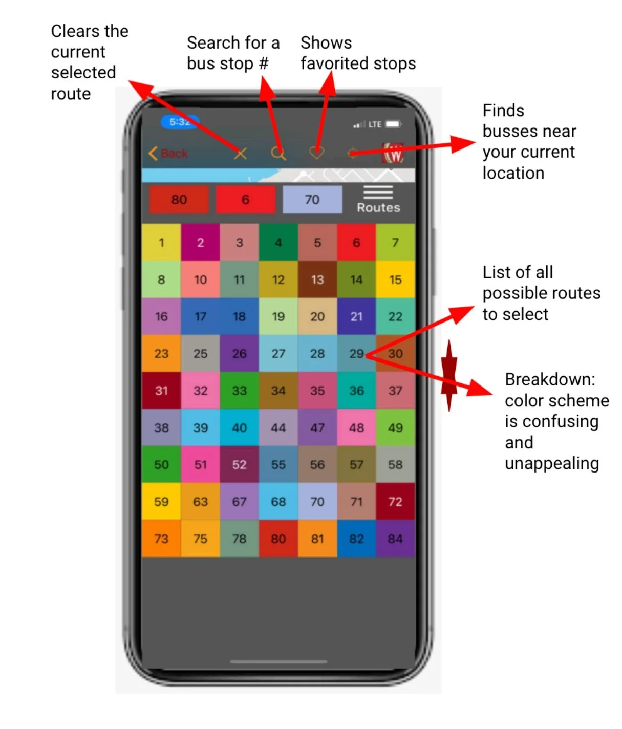
ARTIFACT MODELS
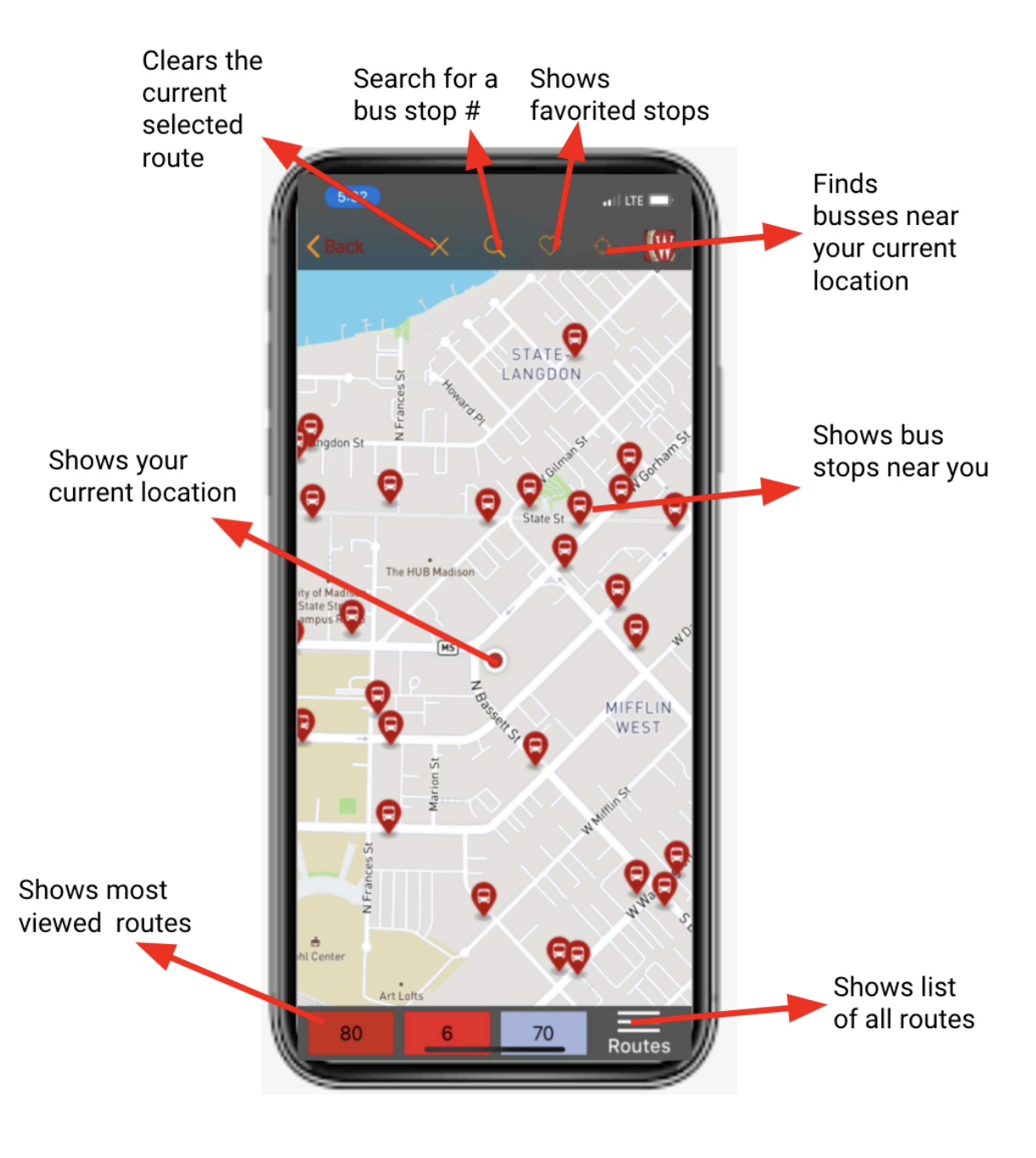
Our findings revealed that users found the app difficult to navigate and frustrating. When attempting to navigate to bus stops, find specific routes, and plan trips, they struggled to identify the correct sequence of actions to obtain the desired information. Many users fumbled through the app, pressing random buttons and growing increasingly stressed and frustrated. Distractions, such as needing to open other apps to answer questions, exacerbated their frustration, particularly when they were pressed for time. However, one feature consistently located and successfully used by all participants was the favoriting of stops. A detailed breakdown of the app's current features and the issues we observed during our contextual inquiry is provided in these artifact models.
IDEATION
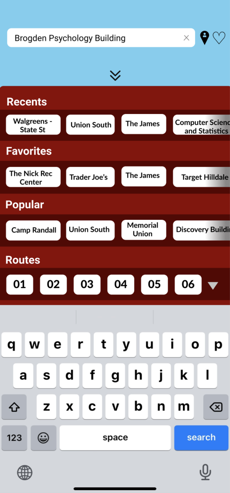
One of the most significant issues that arose when conducting the contextual inquiry was the search function. The app only allowed users to search for a stop by its number. As one user remarked, "I think my biggest problem with the app is searching for the four-digit stop number." To improve this, we decided to add a more intuitive search function.
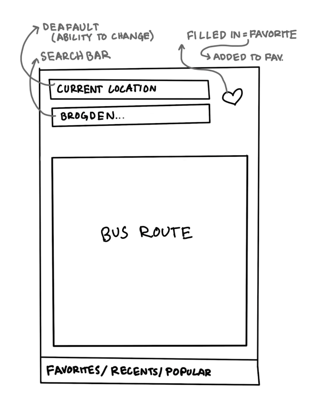
Users found the previous magnifying glass icon unintuitive, so we replaced it with a search bar at the top of the screen for easier navigation.
Users mentioned that they needed to have prior knowledge of the campus and bus route numbers to navigate the bus lines. However, unfamiliar lines and areas were nearly impossible to navigate. For instance, when a user was asked to navigate to Hilldale, an area they were somewhat familiar with, they had to click on random stops until they recognized a route. We addressed this issue by implementing a search function that allows users to look up their final destination and determine the appropriate route.
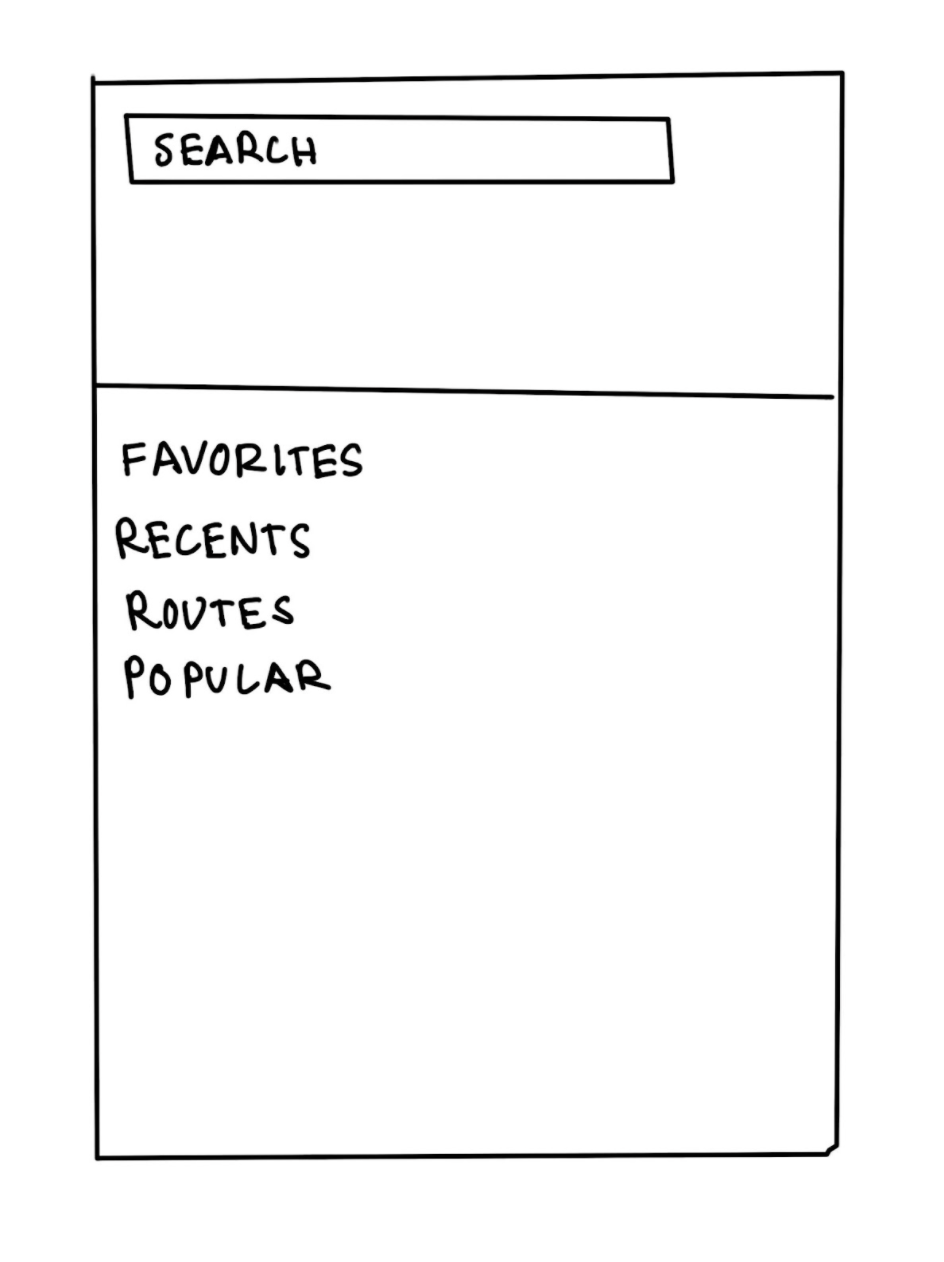
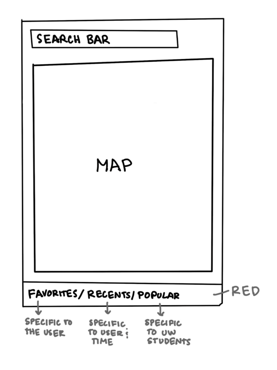
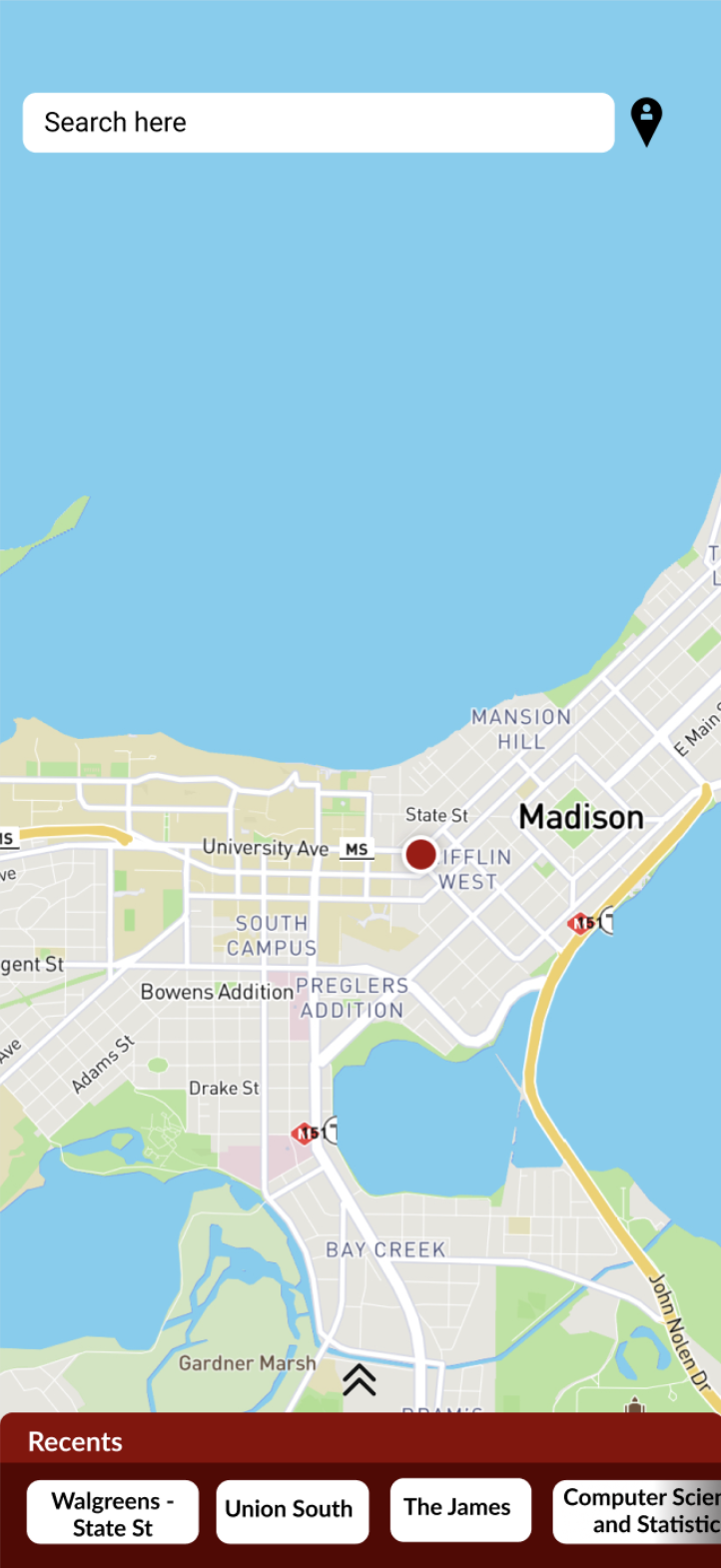
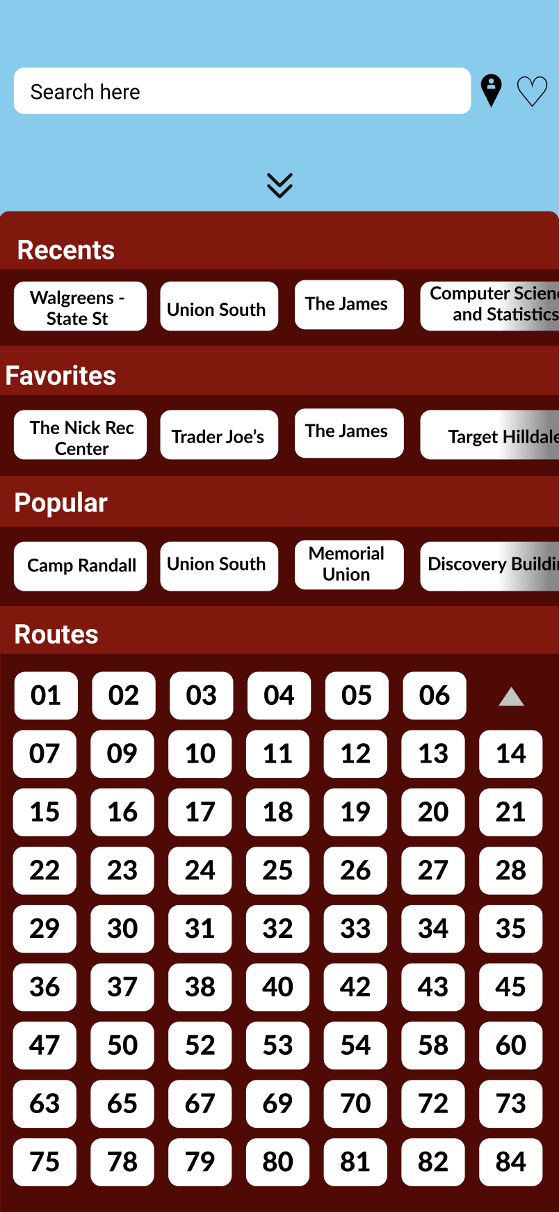
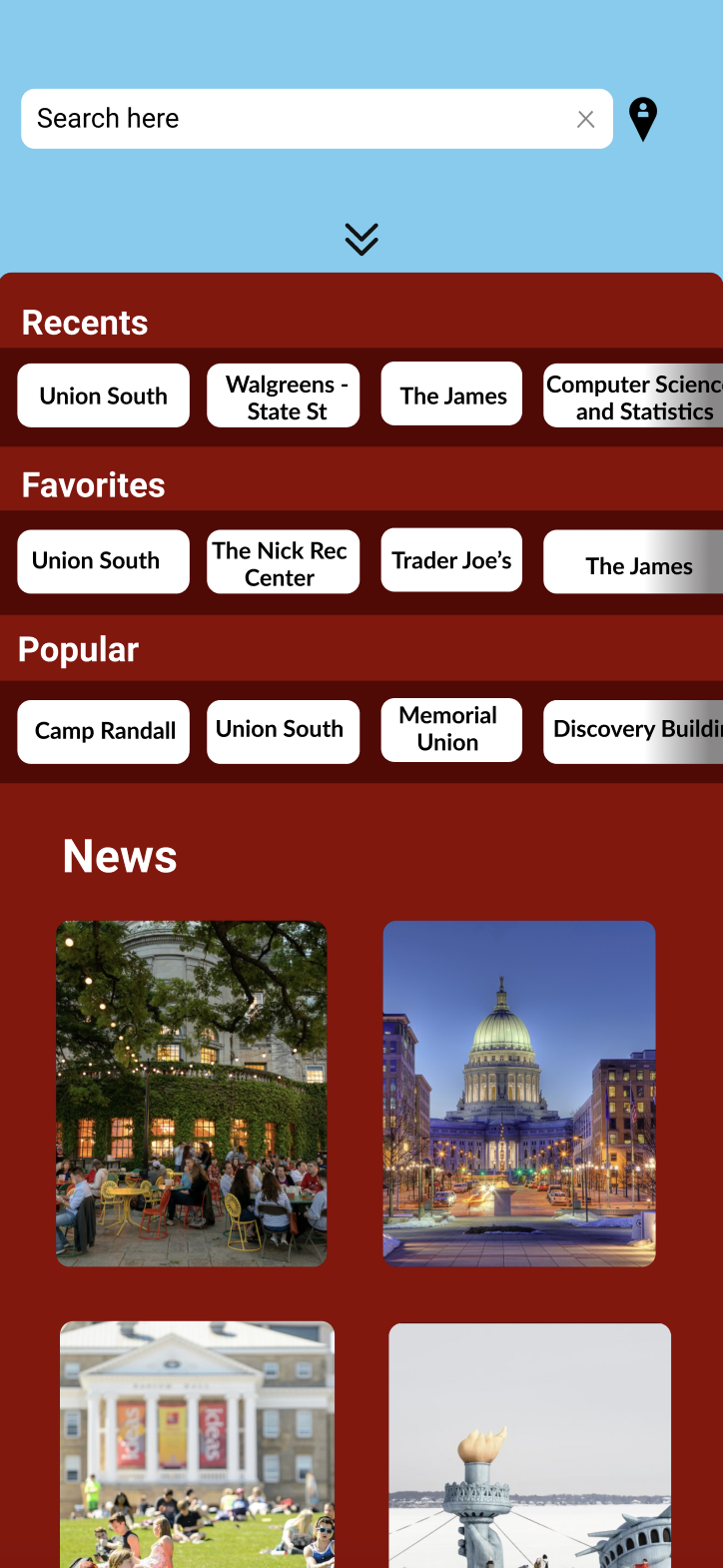
We also introduced a swipe-up menu that enables users to effortlessly browse destinations categorized by favorites, popular spots, recent searches, and bus route numbers. This menu, inspired by user feedback on various issues, was designed to centralize app features in a way that makes them more intuitive and accessible.
While certain aspects of the app were well-received, we identified opportunities for enhancement. One such feature was the favorites function. In the current app, users can favorite a bus stop, which is then saved to a list. Users appreciated this intuitive feature, where a heart icon next to the stop name would fill red when selected, automatically saving it. However, users were more interested in favoriting destinations rather than specific stops. Thus, we modified the app to allow users to favorite destinations, which are then saved to a favorites list in the pull-up menu.
Additionally, users enjoyed the campus-specific features of the app, such as named buildings and the ability to navigate from the home screen to a section showcasing other Wisconsin app features. Although many users were unaware of these features or had not used them previously, they indicated they would be more likely to do so if they were more accessible.
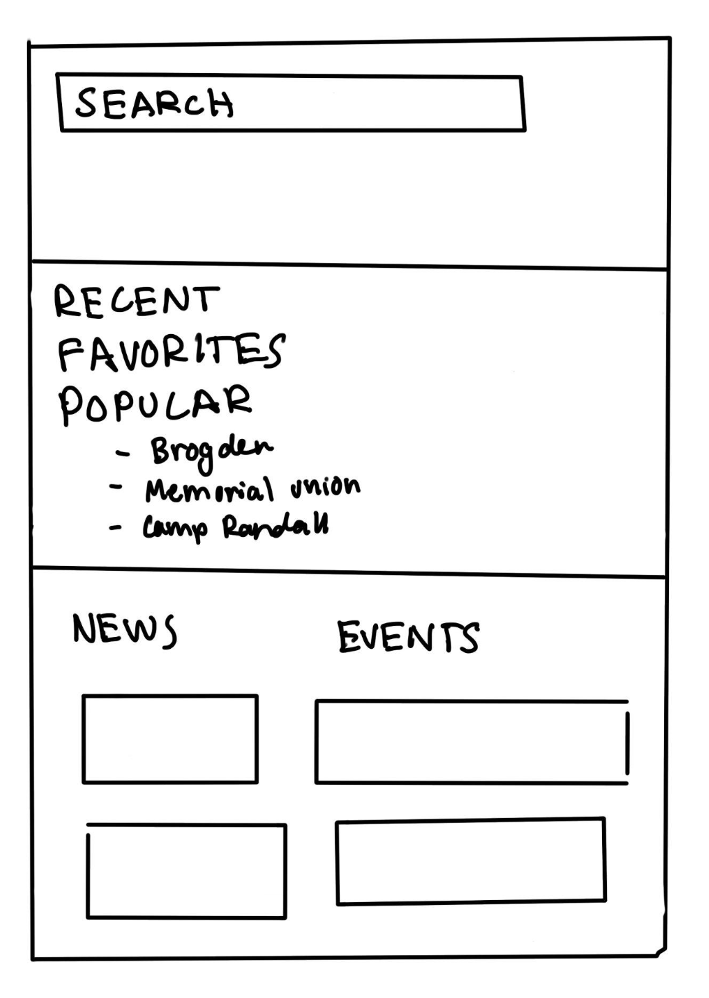
To address these issues, we added a “Popular” section in the swipe-up menu, featuring popular UW campus destinations. Furthermore, we included a “News and Events” section, which contains campus news and events, in the extra space below the options menu, ensuring users can easily access this information while browsing destinations.
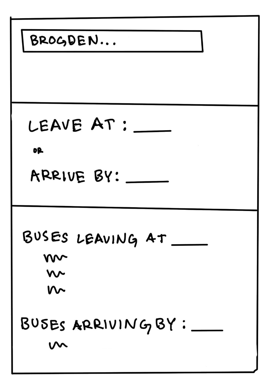
Furthermore, users expressed a desire to know when the bus would arrive at their destination. One user noted, "I have no way to know when I'm going to get to this place. If I have class at 7 or 6:30, I don't care when it's picking me up; I care when it's going to get there." To resolve this, we added "Leave at" and "Arrive by" functionalities, enabling users to select their departure time or preferred arrival time, ensuring they can plan their journeys more effectively.
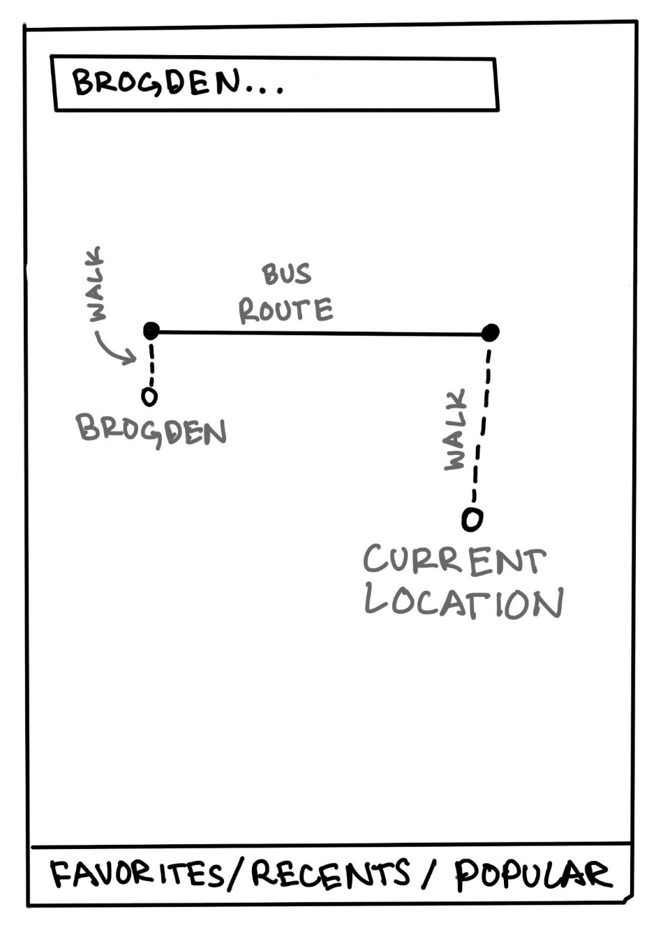
Another significant issue users faced was navigating from their location to the bus stop. The app only displayed the user's current location, the bus stop, and the entire bus route. Users expressed a need for clearer directions to the bus stop without having to infer from the map. To address this, we added a dotted line to indicate the walking route from the user's current location to the bus stop. Additionally, we included a dotted line showing the walking route from the destination bus stop to the final destination. For example, when a user tries to get to Brogden, the bus won't take them door-to-door, so the user must walk to and from the bus stop.
PROTOTYPING
LO-FI PAPER PROTOTYPING
Based on insights from our contextual inquiry, we decided to add a search bar for easy and quick navigation. Additionally, we implemented a bottom footer that, when activated, would generate a route from the user's current location to their selected destination. At this stage in the prototyping process, we were still determining which metric to represent in the bottom footer—options included "Favorites," "Recents," and "Popular."
We also wanted to enable users to change their starting location, which led to the inclusion of a second search bar in diagram 2. Lastly, we recognized the need for a favoriting feature, although we were still deciding whether users should be able to favorite routes or destinations.
HI-FI FIGMA PROTOTYPING
We decided to feature "Recents" in the footer at the bottom of the main screen, displaying the user's most recent destination searches. We believed this would be the most accurate metric for predicting a user's search queries. Additionally, we chose to allow users to favorite specific destinations, rather than routes as in the original UW app. This approach made more sense to us, as users' locations are dynamic. By favoriting a destination, a route can be created from the user's current location to the specified destination.
Following usability testing with several participants, our team decided to incorporate a feature suggested by multiple testers: enhancing the visibility of UW-specific services. Participants mentioned that adding unique, campus-specific features would increase their likelihood of choosing this updated UW app over competitors like Google Maps or Apple Maps. After careful consideration, we added a "News" section where users can access articles related to upcoming campus events and activities.

EVALUATION
Throughout the prototyping and development of our final solution, we conducted iterative usability evaluations after each design change in a formative manner. In these evaluations, we considered factors such as learnability, efficiency, memorability, errors, and satisfaction, along with baseline usability metrics: usefulness and desirability. We paid close attention to the design needs of our target users—college students at UW-Madison and campus visitors of all ages. Additionally, we considered the common tasks users would perform with the app, allowing us to refine campus-specific features. Empirical usability testing methods guided our evaluation.
We selected two users from our contextual inquiry (CI) and two new users to participate in concurrent think-aloud usability tests, providing feedback on our prototype's usability. Three tests were conducted on campus, and one was conducted at the user’s home, reflecting the typical settings where they would use the app. Our testing format mirrored our CI approach, with one person leading the interview, another taking notes, and a third videotaping. The notetaker recorded quantitative data, including task completion times, errors, confusions, breakdowns, workarounds, successes, and failures.
We asked participants to perform tasks from our CI, such as finding nearby buses, navigating to Union South, and locating bus route #7. Additionally, we introduced four new tasks: searching for a route from the recents section and the search bar, viewing all bus routes, determining departure and arrival times, and finding campus-specific features. After each task, we paused to draft improvement ideas and sought user feedback before proceeding to the next task. This iterative process allowed us to refine our prototype through four rounds of usability testing and improvements.
One consistent feedback was the lack of campus-specific features, which didn't differentiate our app enough from competitors like Google Maps and Apple Maps. In response, we added a section for campus and Madison-related news and events. Despite Figma's limitations, we considered implementing a heat map feature to show where users are congregating, providing insights into campus events or popular activities. We also introduced a “Popular” section highlighting popular campus destinations.
Another key feedback was the absence of directions to bus stops, which users wanted included. This was an easy update applied to our prototype.
Through our four iterations of usability testing, we discovered that features intuitive to us as students familiar with user interfaces were not always intuitive to our users. This led to valuable discussions on making these features more user-friendly. We also learned that users preferred fewer features per page, as an overcrowded interface was overwhelming and less intuitive. Overall, these iterative usability tests were crucial to achieving user approval for our prototype.
DEMONSTRATION AND DELIVERABLE
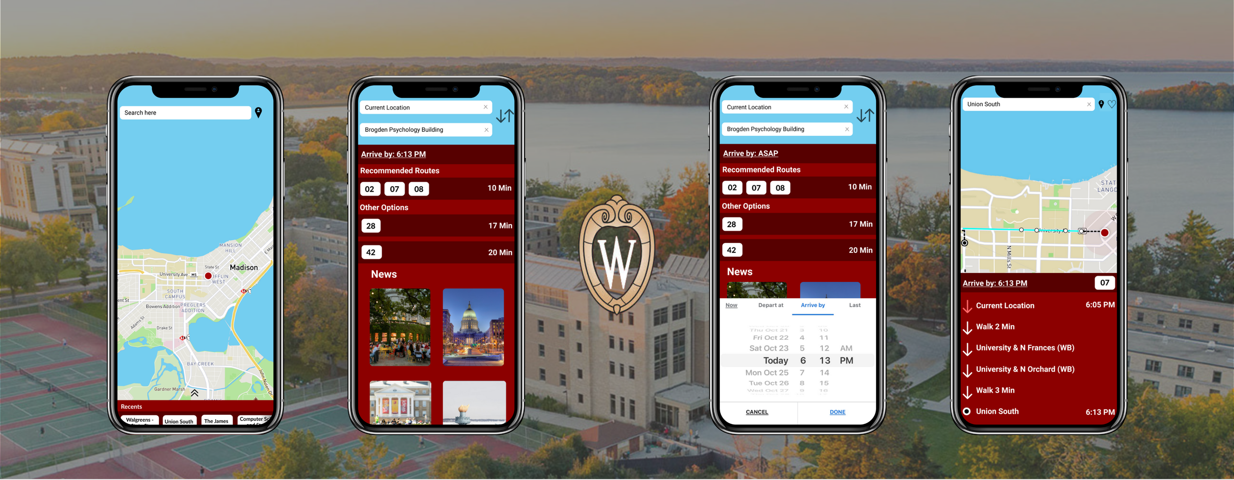
Our final solution was implemented using Figma. We focused on two key destinations to demonstrate our solutions features: Union South and Brogden Psychology Building.
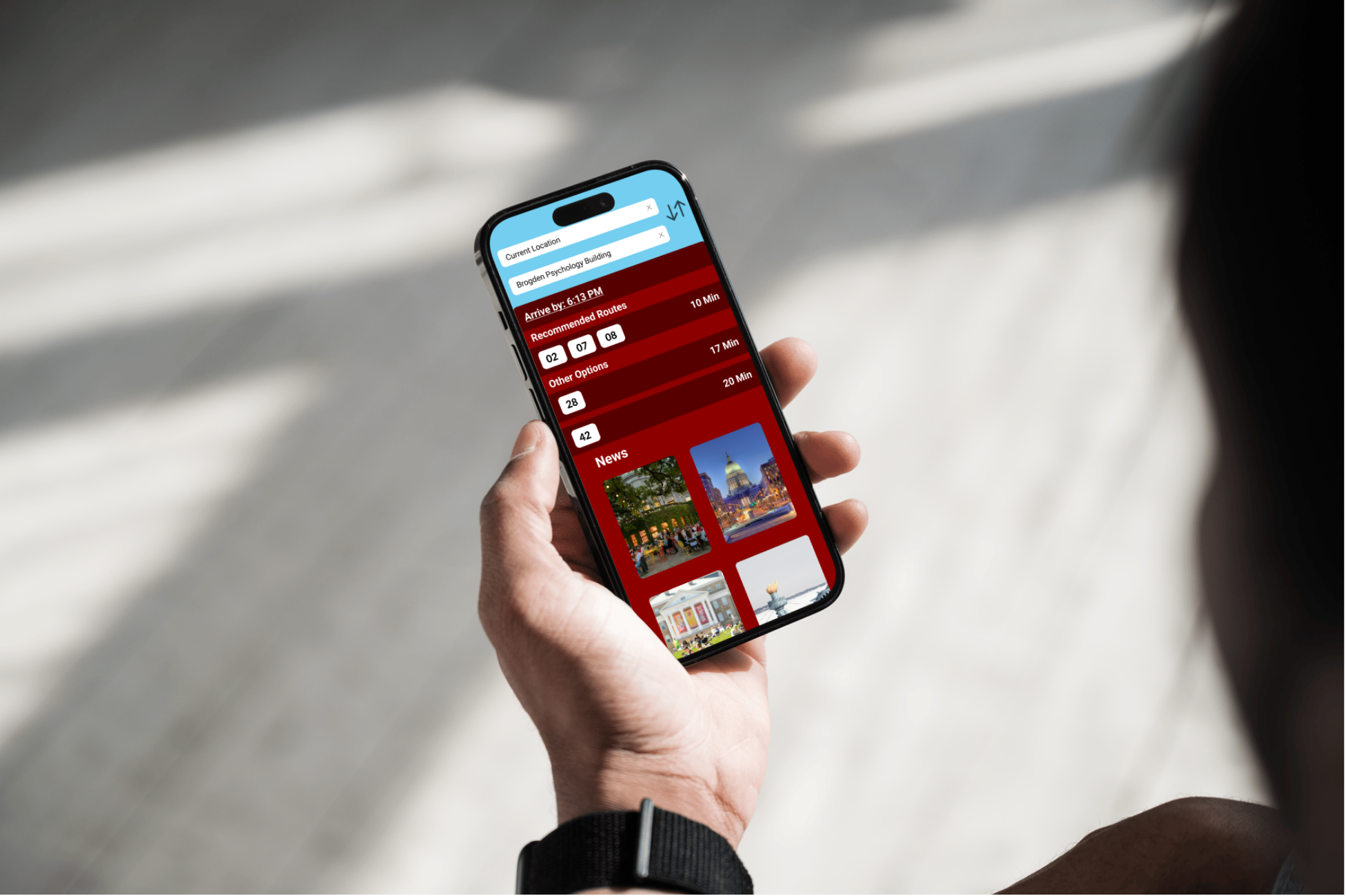
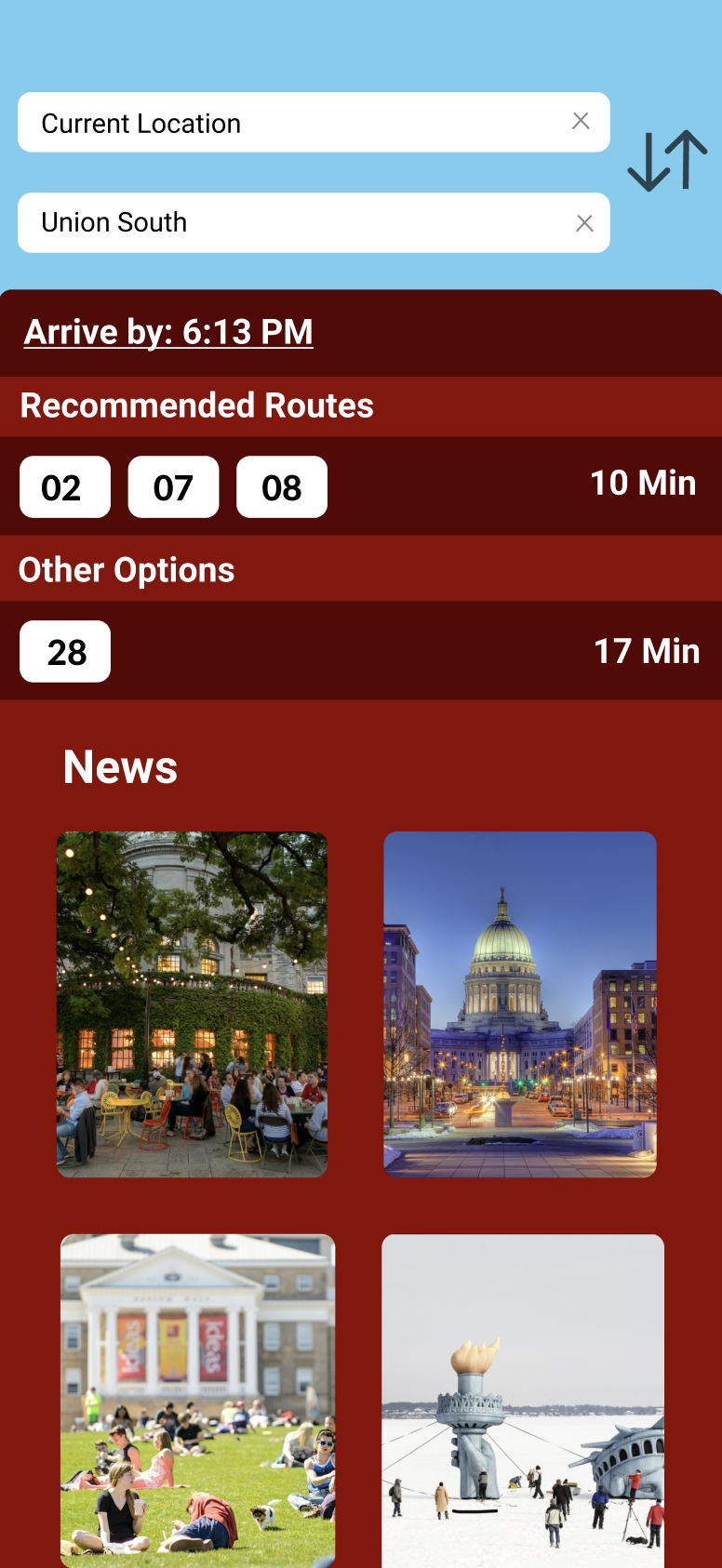
BROGDEN PSYCHOLOGY BUILDING
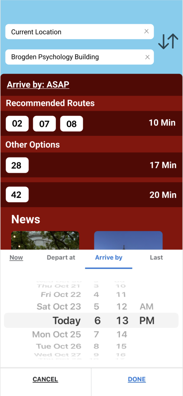
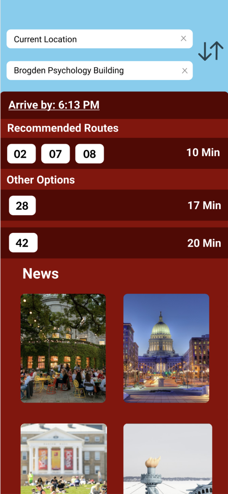
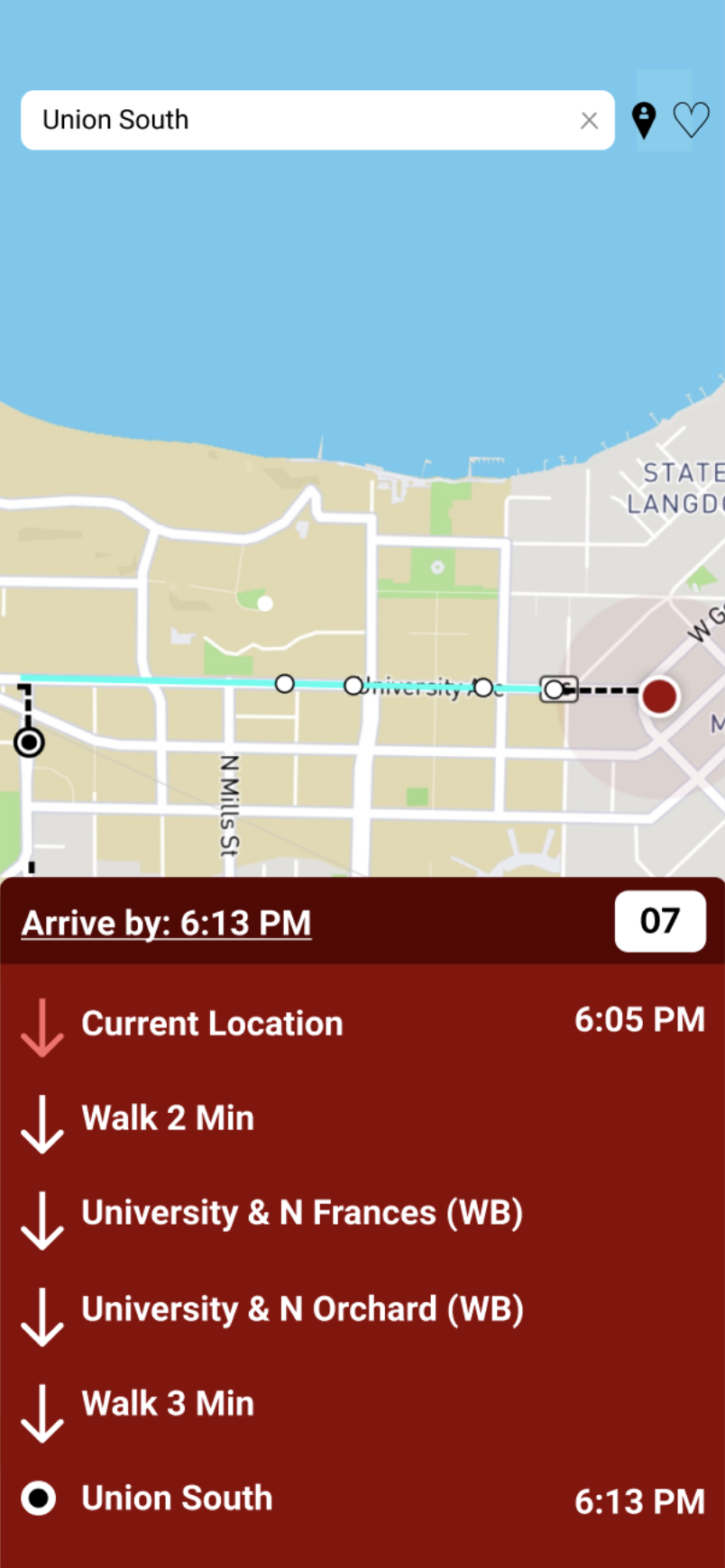
For traveling to Brogden, we demonstrated the search functionality. Users navigate from the home page, click the search bar, type "Brogden," and select their desired arrival time to view available bus options. When the search bar is clicked, a pull-up menu appears, displaying categories such as Recents, Favorites, Popular, and Routes, along with a keyboard for entering searches. After entering a destination, a second search bar allows users to change their departure location. Clicking the default "Now" button in the pull-up menu activates a clock function, enabling users to set a specific departure or arrival time. In this scenario, the user selects a departure time of 6:13 pm. After pressing "Done," the screen displays the best bus routes to arrive by 6:13, along with other options.
Smaller features include an "X" button to return to the home screen after a search and a centering element to the right of the search bar, which re-centers the map on the user's location when pressed.
UNION SOUTH

For Union South, we highlighted the "Recents" category at the bottom of the screen. If the user has recently visited Union South, this destination auto-populates. The user selects an arrival time of 6:13 pm, and the screen displays bus route options. Choosing bus number 7, the screen outlines the walking and bus route, arrival time, and necessary steps.
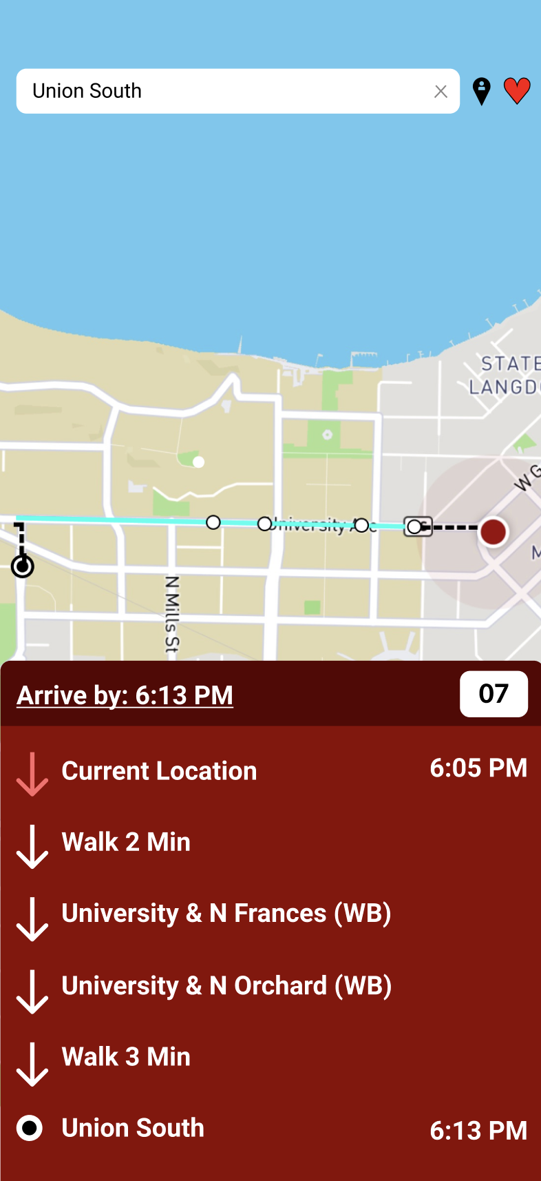
When a destination is searched, a small clear heart next to the search bar allows users to favorite it. Favorited destinations turn the heart red and add the location to the favorites list in the pull-up menu.
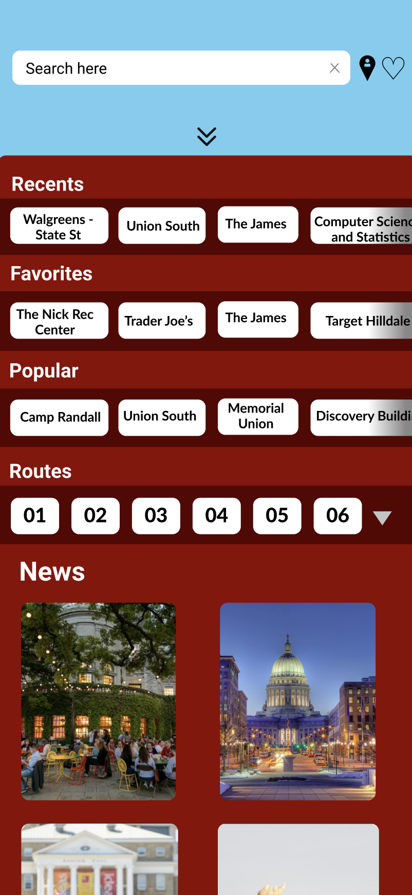
The pull-up menu is accessible from the home screen by swiping up. This menu displays the Recents, Favorites, Popular, and Routes sections, which can be scrolled horizontally. The news section appears at the bottom, with more news and events accessible by scrolling down. Clicking the down arrow next to the "Routes" section expands it to show all routes, similar to the original app. Clicking the arrow again collapses the section.