
TIKTOK CULTURAL PROBE ANALYSIS

PROBLEM
TikTok, although extremely popular among younger generations, has aspects that are frustrating for users to navigate. I wanted to explore these issues by conducting a cultural probe and analyzing the the results.
SOLUTION
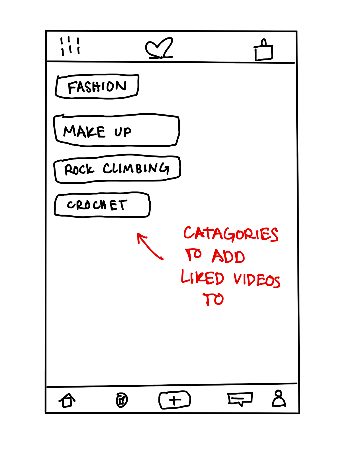
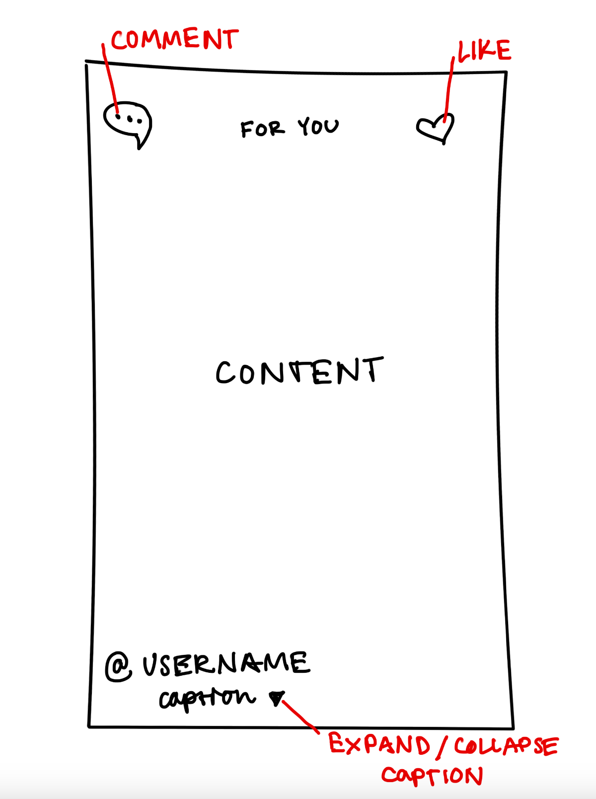
Through my cultural probe I discovered two main areas of discomfort: visual “noise” at the bottom of the screen and lack of organization for liked videos. I proposed decluttering the information (music, captions, icons, etc.) around the videos and adding categories for liked videos to be saved under.
MY ROLE
I served as the sole designer and researcher for this project.
SCOPE
This was a project created during a Human-Computer Interaction class from September to October in 2021.
For this project, I chose to analyze TikTok usage by conducting a cultural probe—a design method used to gather qualitative user data through observation by giving participants artifacts and tasks. TikTok is a social media app that has grown immensely over the past couple of years, attracting users of all age groups for a variety of purposes. It is particularly popular among younger people, especially those 25 and under. Most college students are familiar with TikTok, even if they are not active users. In the past year alone, TikTok has published multiple updates to fix bugs and enhance the interface. Despite the app's popularity and its praised “personalized algorithm,” there appear to be some drawbacks. To explore these potential issues, I gathered data from two TikTok users for my analysis.
USER POPULATION
The user population I analyzed consisted of TikTok users with moderate to high usage levels. Both users were undergraduate students at the University of Wisconsin-Madison who identified as active TikTok users.
User 1: A 21-year-old white woman majoring in Journalism and English, who describes her TikTok usage as moderate.
User 2: A 22-year-old white woman majoring in Industrial Engineering, who describes her TikTok usage as high.
Both users access TikTok multiple times a day, primarily to unwind and occasionally to look up topics of interest. They both consider TikTok one of their main forms of social media and a significant source of news.
PROBE DESIGN
I aimed to design a probe that would be easy for users to navigate to after closing the TikTok app. Additionally, I wanted the probe to offer clear options for some questions to guide users in thinking about their usage, allowing me to easily compare answers and collect information. I created my probe using a Google Form, which I sent to users to fill out after using TikTok.
I conducted quality control before, during, and after data collection. Initially, I interviewed each user to ask basic questions about their TikTok usage, gaining an understanding of their user habits. I also briefed them on the project's expectations and how their data would be used. I requested that users resubmit the form each time they used TikTok and reminded them throughout the process. To incentivize participation, I offered to buy dinner for each user after the final form submission.
The form included six questions designed to be manageable so users wouldn't be deterred from submitting multiple times a day:
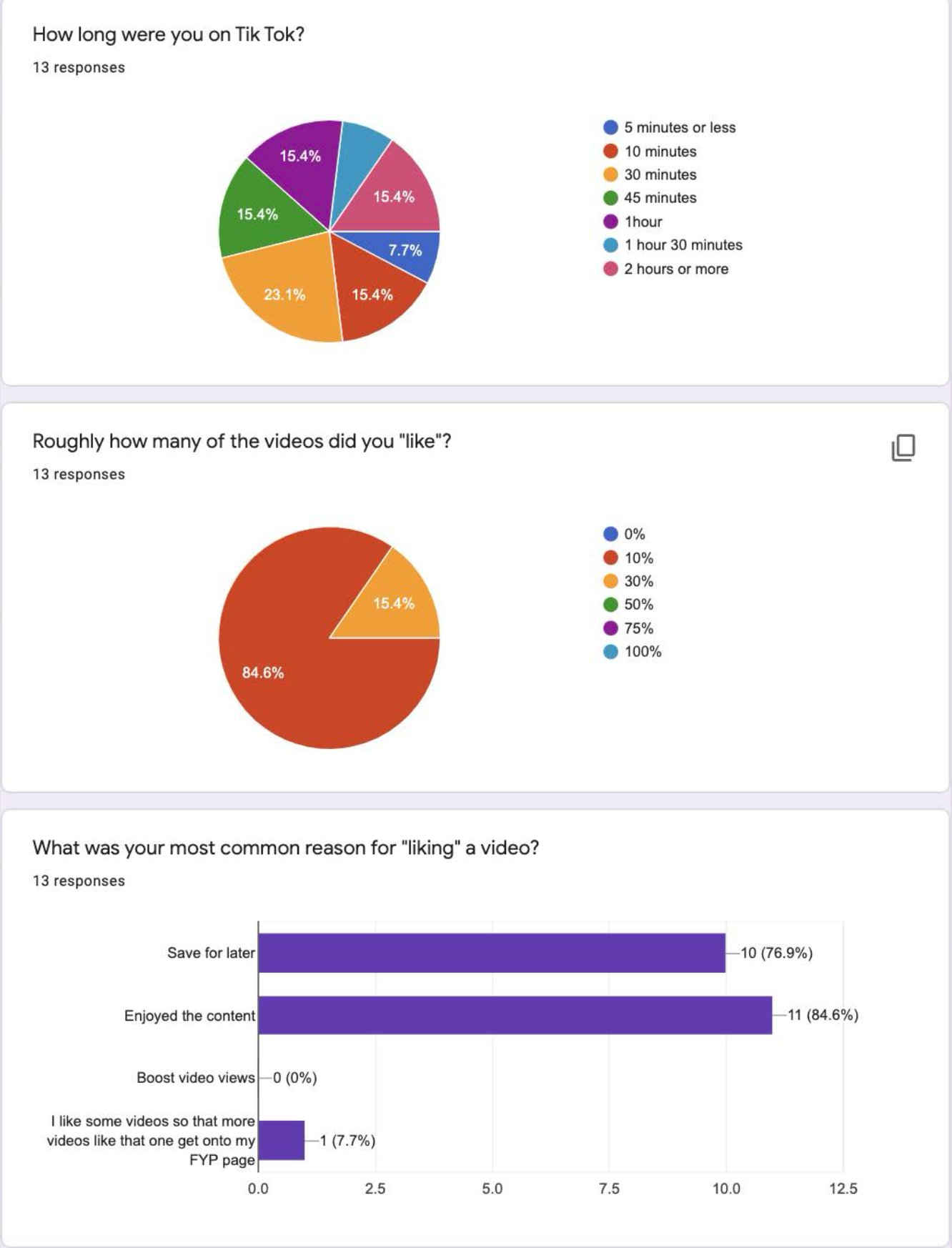
How long were you on TikTok?
Users chose from specific time increments ranging from less than 5 minutes to 2 hours.
Roughly how many videos did you like?
Options ranged from 0% to 100%.
What was your most common reason for liking a video?
Choices included "Save for later," "Enjoyed the content," and "Boost video views."
Users could also write in their own answers for the first three questions.
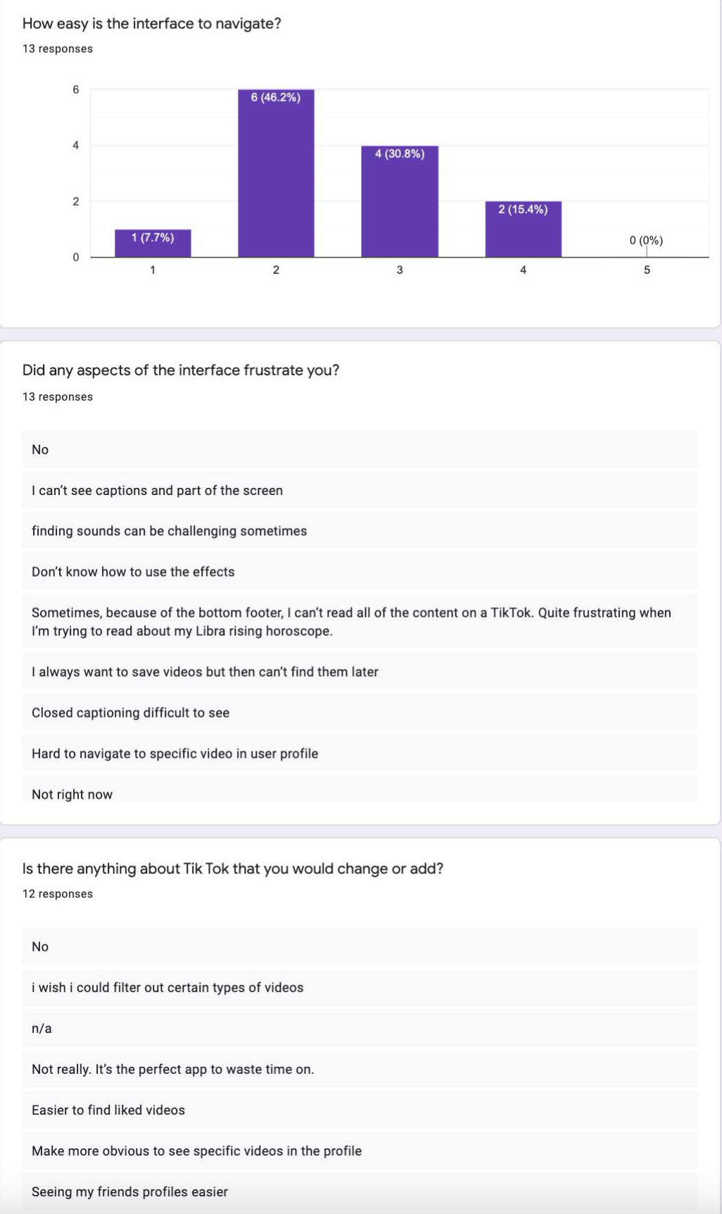
How easy is the interface to navigate?
Users selected from five options ranging from "Easy" to "Difficult."
Did any aspects of the interface frustrate you? (Open-ended)
Is there anything about TikTok that you would change or add? (Open-ended)
The questions were designed to encourage users to analyze the app's drawbacks without bias, and I was particularly interested in their reasons for liking videos. The study spanned four days, with daily reminders to fill out the form after using TikTok. After the final form submission on the fourth day, I conducted final interviews to gather any additional information not captured in the form.
METHOD
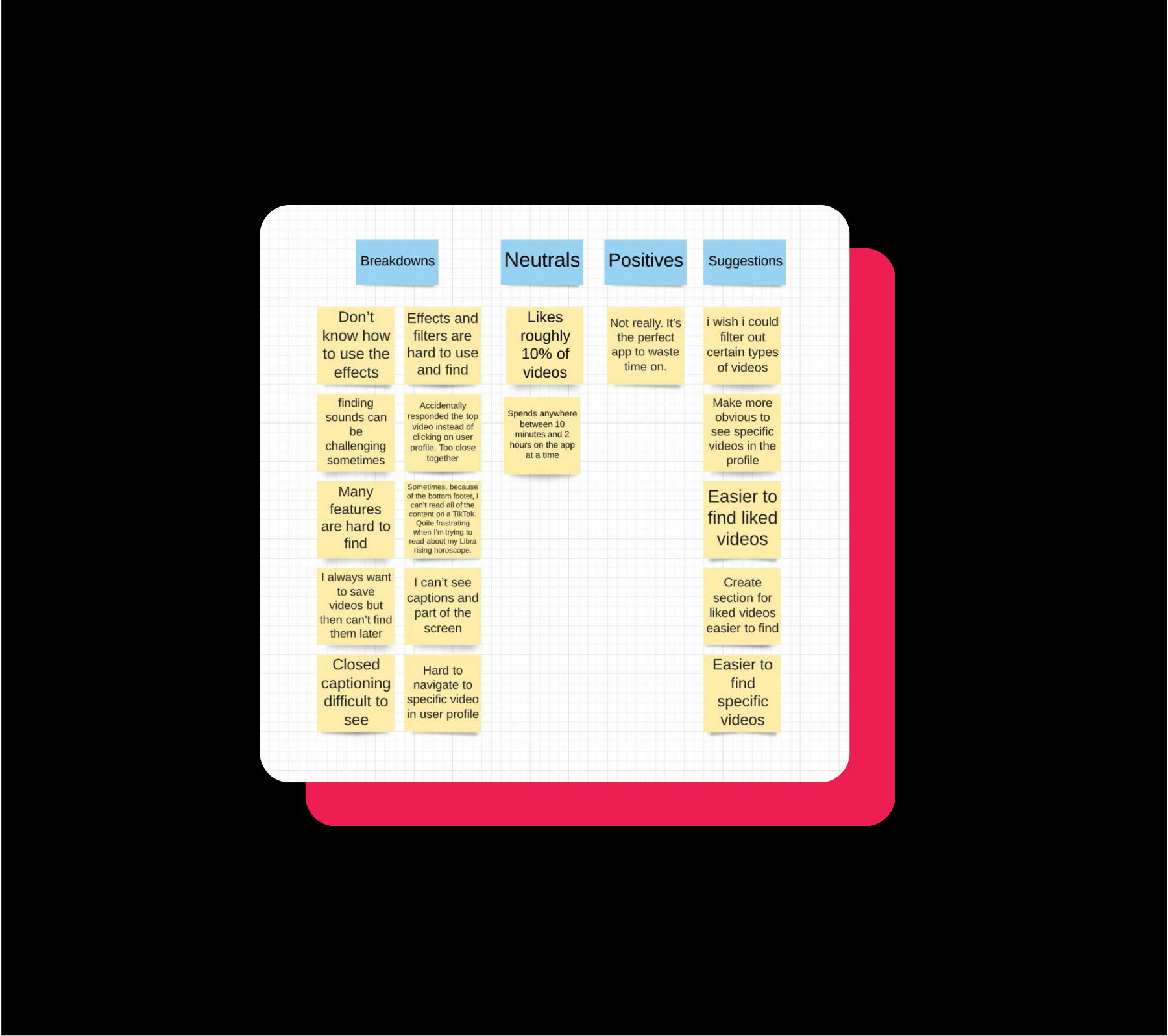
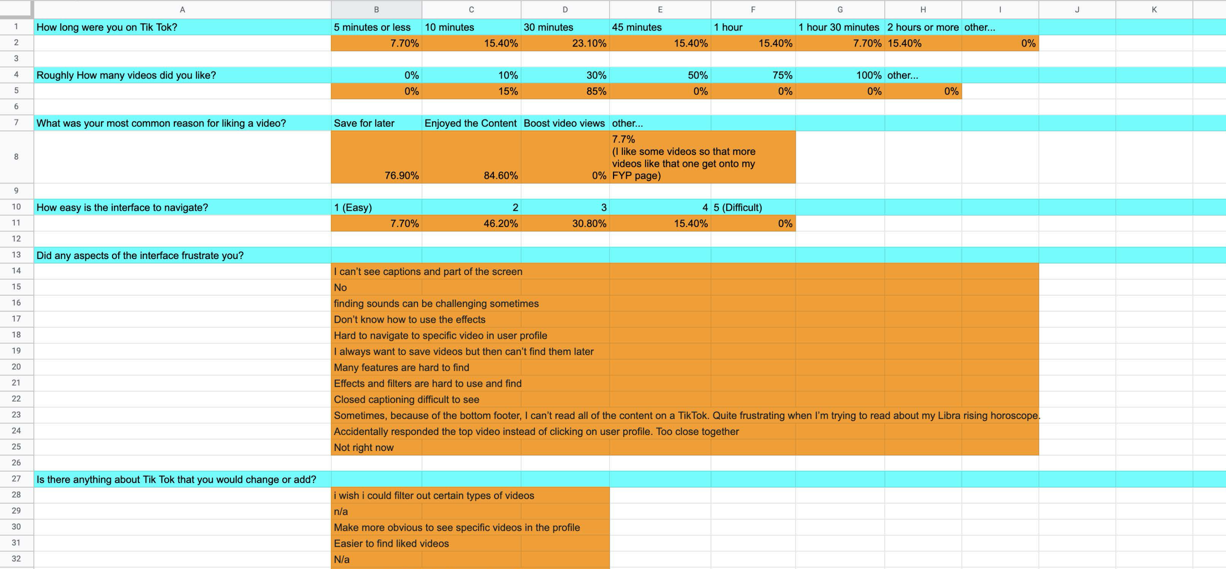
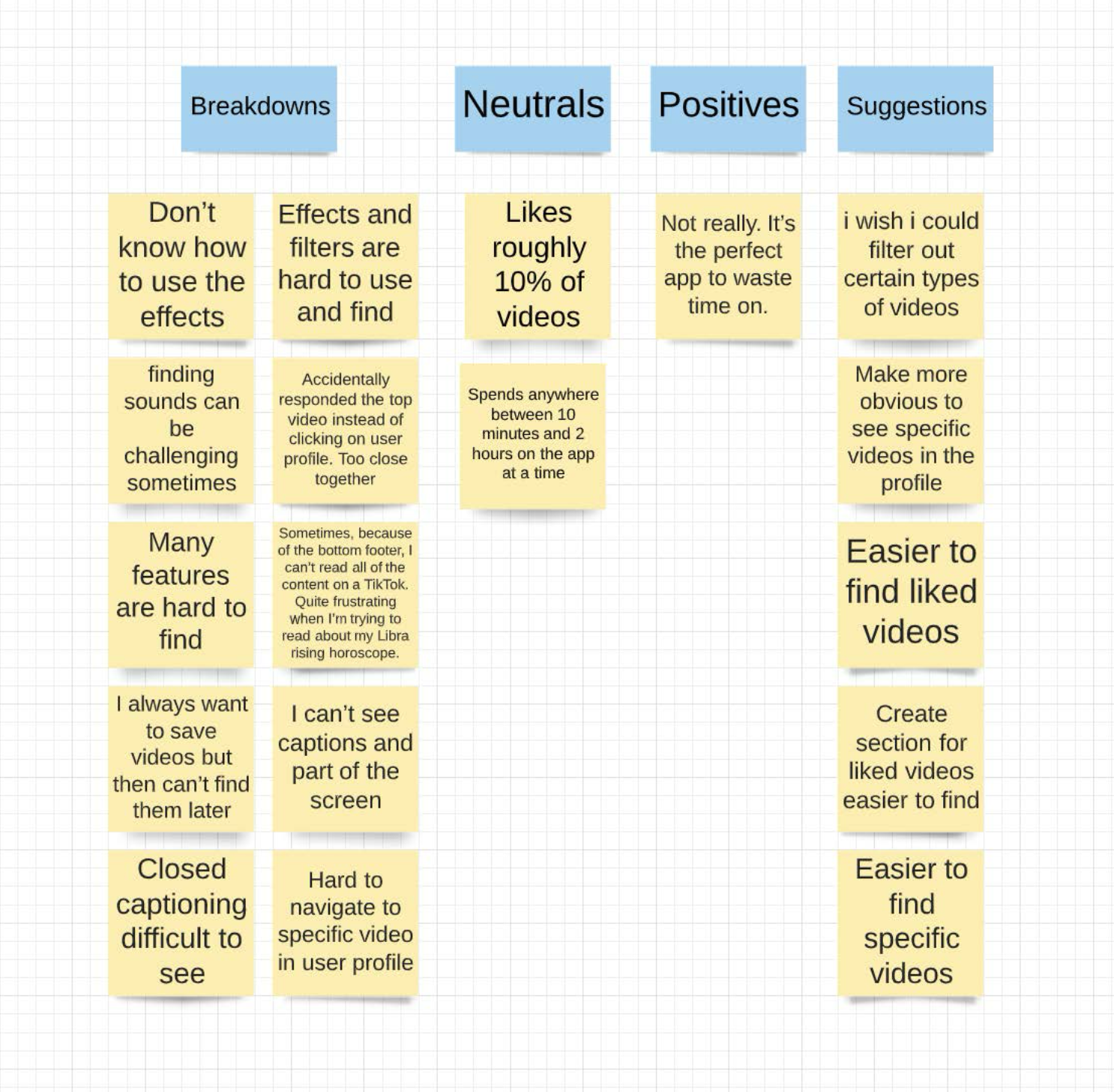
Google Forms helped me organize the responses by providing the percentage of answers for each multiple-choice question. I compiled the responses into an Excel sheet, using color coding for clarity: blue for different questions and orange for their responses. To further analyze the data, I transcribed all the content onto sticky notes, categorizing them into "Breakdowns" (where users encountered issues), "Neutral" (neutral observations), "Pros" (things users liked about TikTok), and "Suggestions" (user recommendations from the form).
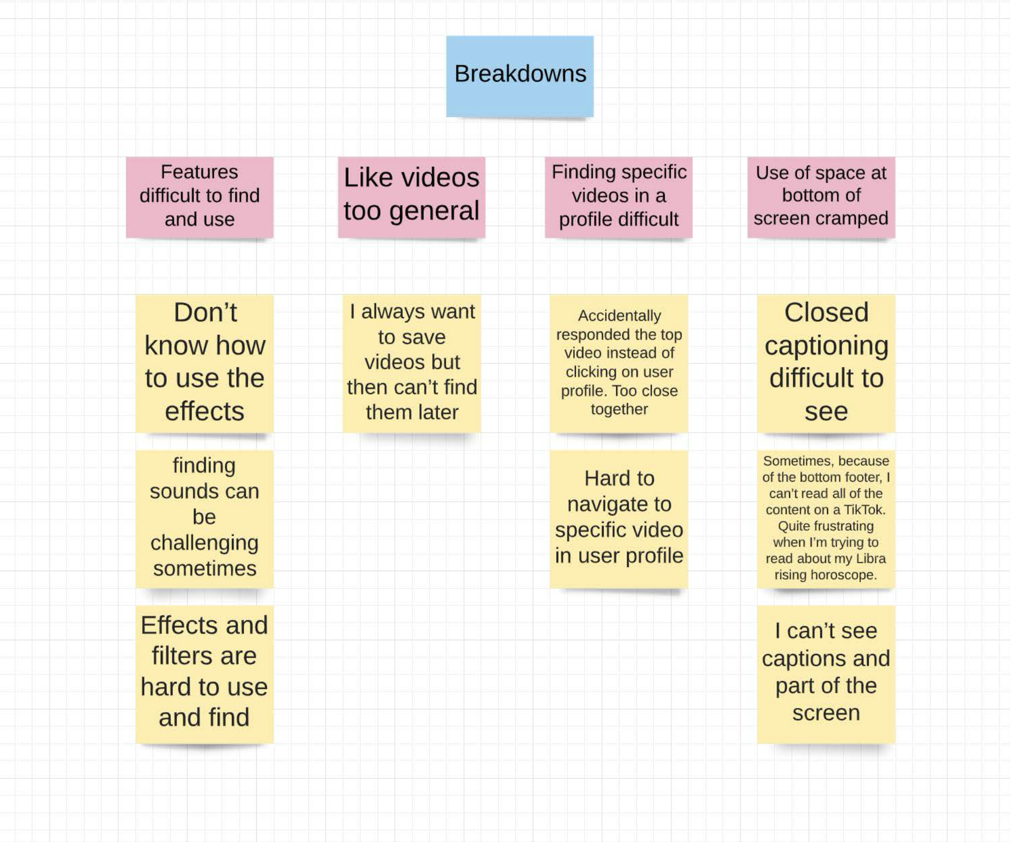
I created an affinity diagram for the breakdowns, further categorizing the reasons users had difficulty with the app into four groups: "Features difficult to find and use," "Like videos too general," "Finding specific videos in a profile difficult," and "Use of space at bottom of screen cramped." I noted that all suggestions, except one, were about issues with saving videos. From this, I decided to focus on the problems with liked videos and the cramped space at the bottom of the homepage screen.
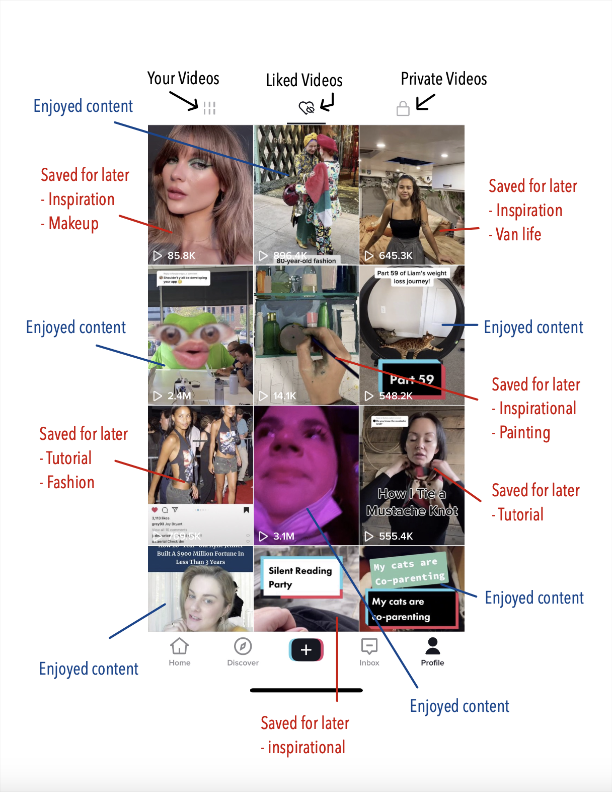
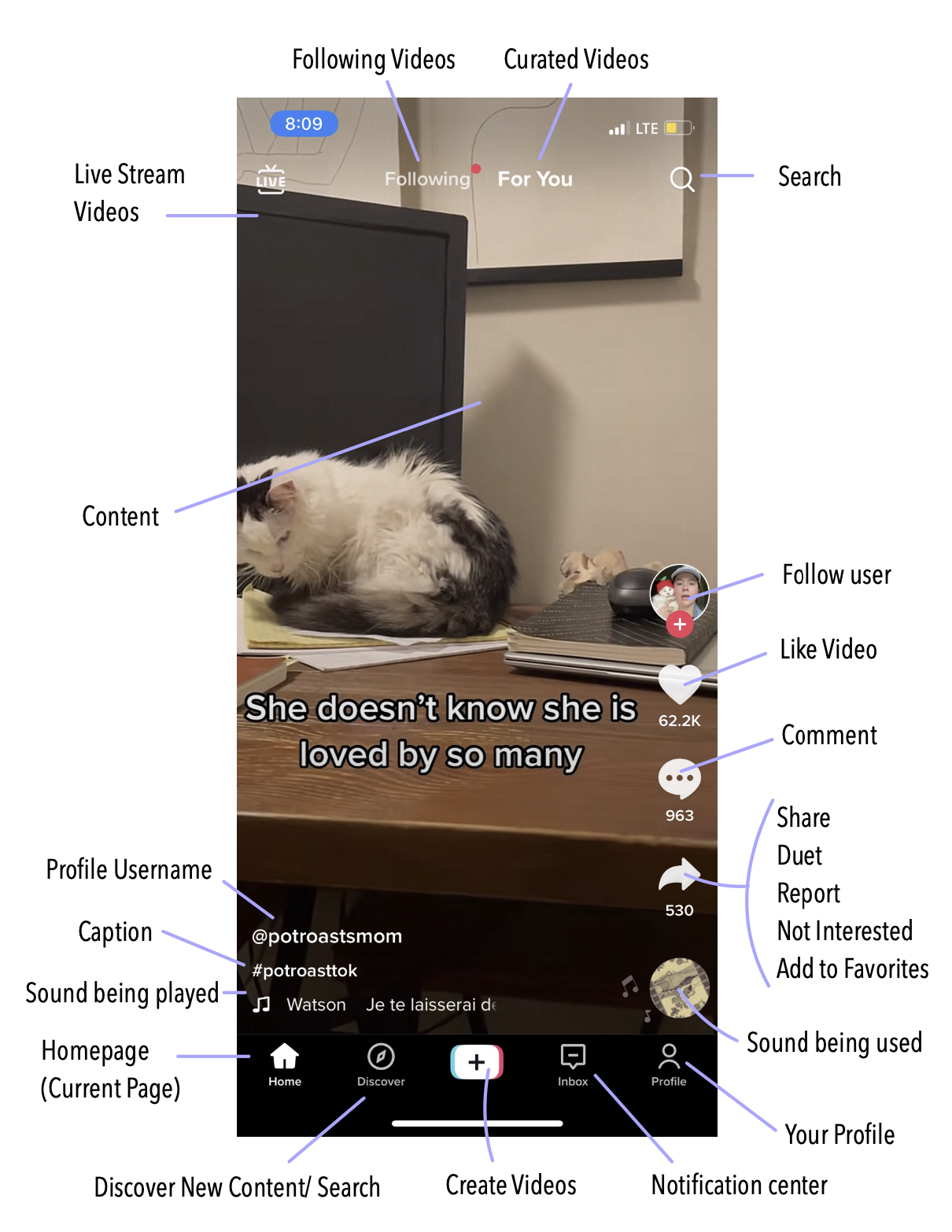
Next, I created two artifact models for key TikTok interfaces: the homepage and the liked videos page. For the homepage, I marked off the buttons and interactions available while scrolling through videos. For the liked videos page, I labeled the most recent 12 videos with the reasons users "liked" them. I then generated stories based on user experiences, collected data, personal experiences, and the app's flow.
SUMMERY
Users tended to encounter two main issues with the interface. First, they lacked adequate space to properly store and view "liked" videos in a way that was easy to navigate. Users expressed a need to save videos they liked for later in a different category than those they liked just for the content. These issues are illustrated in the following story:
STORY 1:
Jenny loves to scroll on TikTok after a long day of classes. Creative and with diverse interests such as fashion and makeup, she often uses TikTok and some of her favorite creators for inspiration. Jenny prefers TikTok over other social media apps because it feels more personal, and she can find full tutorials on new ideas. She frequently “likes” videos to save them for later, but reviewing her liked videos is time-consuming since they are mixed with puppy videos and comedy sketches. Separate, customizable categories for storing liked videos would help Jenny pull inspiration more efficiently and significantly reduce the time spent searching.
STORY 2:
Camila uses TikTok intermittently throughout the day and to unwind at night. She enjoys story-style TikToks but often gets frustrated when she can't read captions on videos because they are obscured by the buttons and information at the bottom of the screen. Despite her attempts, she can’t seem to remove the clutter. Decluttering the bottom of the screen to make more of the video visible would enhance Camila's viewing experience.
These stories highlight two key areas for potential improvement in the TikTok app. First, introducing separate categories for liked videos would make it easier for users like Jenny to retrieve content for later use. Second, decluttering the bottom of the homepage screen would allow users like Camila to better view the video content and captions. Implementing these changes could significantly enhance user satisfaction and make the app more user-friendly.
REFLECTION
I enjoyed the opportunity to conduct a cultural probe, although I did encounter some unexpected challenges. I was worried my users would forget to submit the forms after using TikTok, so I made sure to remind them daily, sometimes multiple times. Balancing between not influencing the users too much and ensuring they understood the type of data I wanted to collect was tricky. Through my quality control, I realized I could have asked more questions about their interests and experiences with different aspects of the app as a whole. I was somewhat surprised that users encountered similar drawbacks to the app as I had experienced. If I were to conduct this again in the future, I would aim to involve more users to have a larger pool of feedback.