
WX BRANDS
Bread & Butter Wine Website
I designed the interiors as well as consulted on the interior architecture of this ski in - ski out contemporary home in Tahoe, California.

OVERVIEW
The previous Bread & Butter website was clunky and difficult to navigate, making it challenging for users to view product information and purchase wine.
The Bread & Butter website redesign addressed numerous user needs, such as making the menu placement more intuitive and enhancing the accessibility of the shop feature.
ROLE/SCOPE
I worked on this project during a graphic design and marketing internship for WX Brands. This project took place between May and August of 2019.
As the Graphic Design and Marketing Intern at WX Brands, one of the largest US wine companies, I played a key role in the website redesign for the flagship brand, Bread & Butter. My primary responsibility on this project was conducting comprehensive research on the websites of Bread & Butter's main competitors.
I developed a detailed Excel spreadsheet to systematically evaluate each competitor's website, cataloging strengths, weaknesses, and overall ratings on a scale of 1 to 5. This analysis allowed me to identify and compare key features, discern common patterns, and pinpoint opportunities for improvement.
I presented my findings and recommendations in meetings with the web design team, offering strategic insights that informed design choices. Some of my key contributions to this project are detailed bellow.
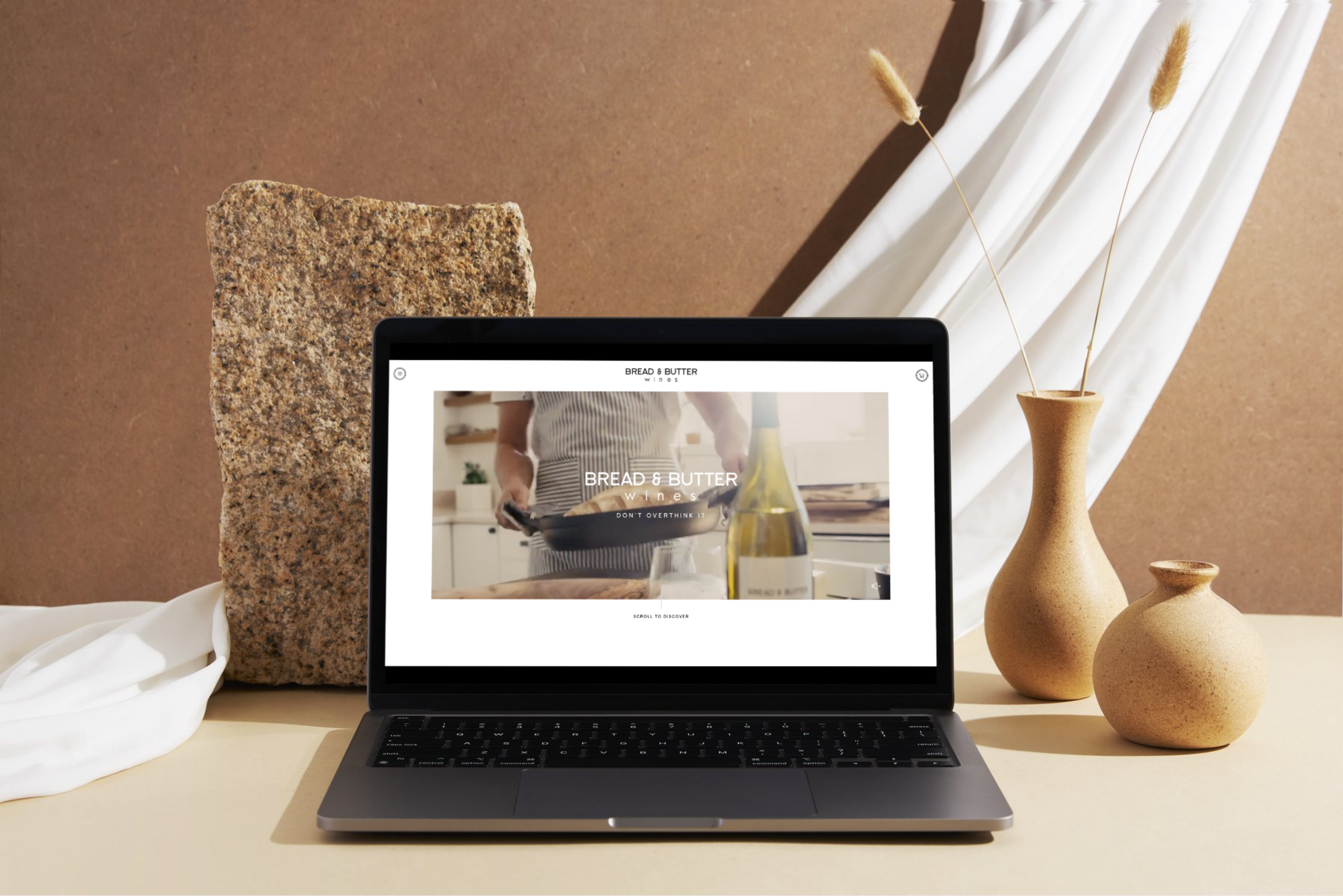
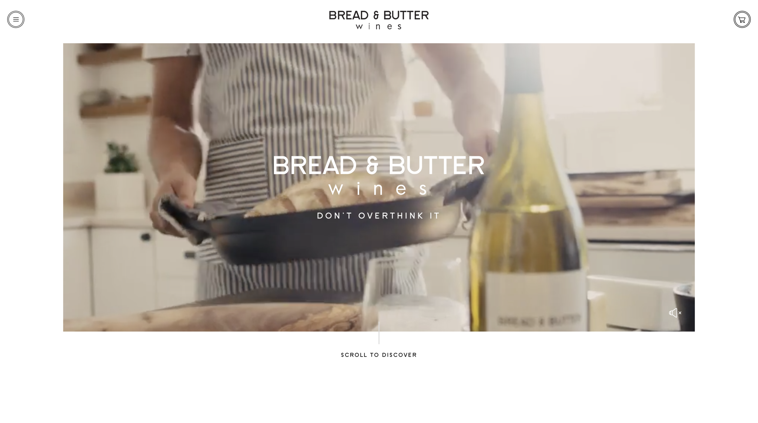
Bread & Butter’s slogan is “Don’t overthink it.” The brand's essence is simplicity, ease, and versatility, much like eating bread and butter together. It was crucial for the website to embody this spirit: simple, yet elegant and dynamic. I proposed a centered site title with a dropdown menu at the top for user convenience. Additionally, I recommended an automatically playing, looping video on the homepage, as I observed that such videos capture attention and increase engagement time.
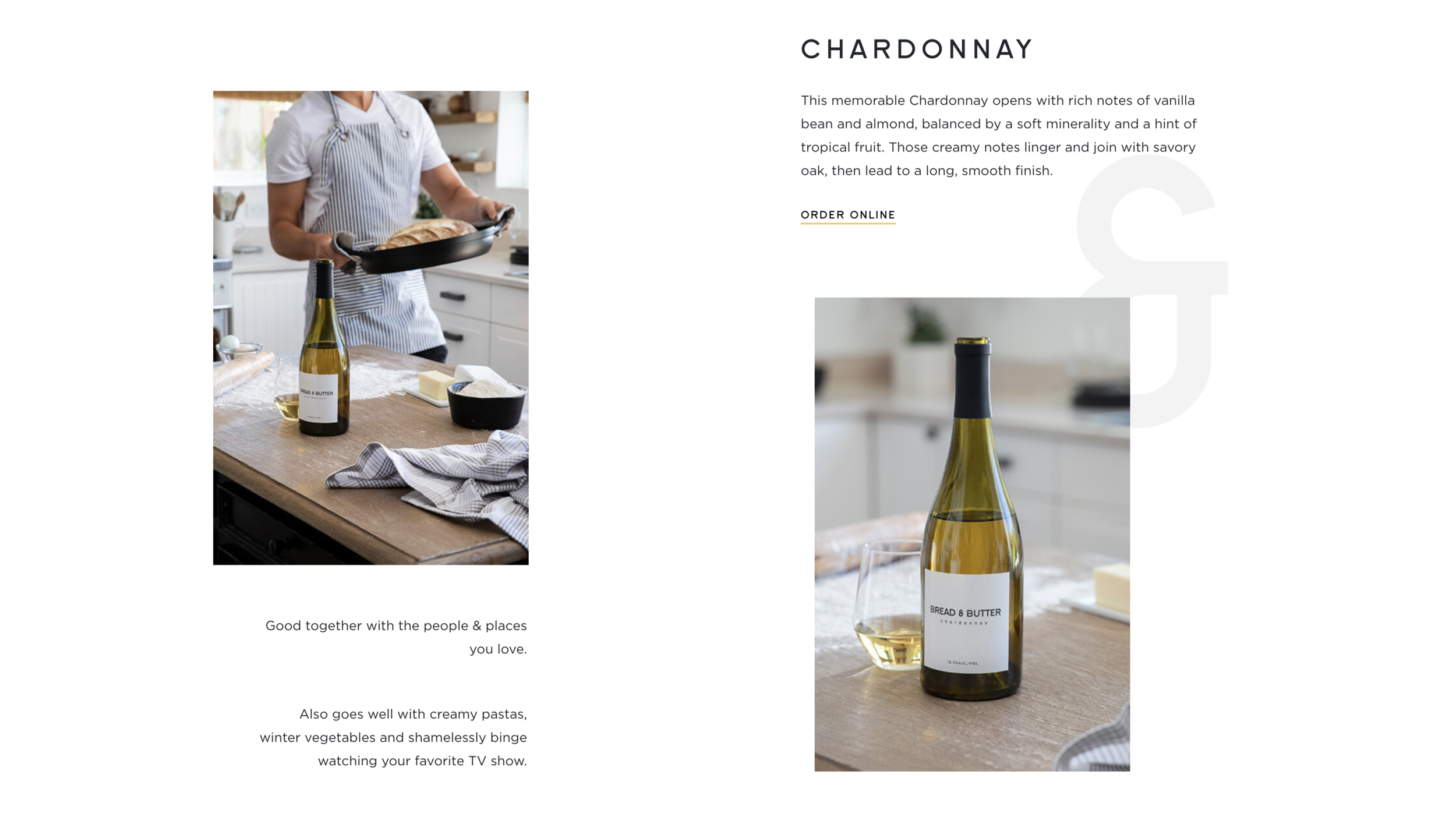
I was particularly insistent on the use of whitespace in the website design. I noticed that the websites which appealed to me most utilized dynamic whitespace that adjusted with the screen size. We aimed to maintain a format that was simple and "light," yet not boring.

I proposed enhancing the site's visual appeal and user engagement by incorporating seamless transitions between pages and interactive pop-ups that appear as users scroll. These transitions ensure a fluid and cohesive browsing experience, guiding visitors smoothly from one section to another. Strategically placed pop-ups provide additional information or highlights, capturing users' attention and sustaining their interest as they navigate the site.

I proposed implementing a dynamic pop-out menu to enhance the user experience. This menu is positioned at the top of the site and, when clicked, smoothly slides out from the left side of the screen. Each page title within the menu is highlighted as the user hovers over it, providing a clear visual cue. Additionally, a corresponding image appears alongside the highlighted title, offering a preview of the page’s content.